Grenadier retail design

HOW FRESH DESIGNED A PURPOSE LED RETAIL SPACE TO SHOWCASE INEOS’ REVOLUTIONARY GRENADIER

When INEOS, one of the world’s largest chemical companies, decided to design and manufacture a high-end, no-nonsense, unrivalled off-road vehicle, they understood that they needed an established brand history and heritage to help identify and distinguish their game-changing Grenadier in the automotive marketplace.

To get it right, the team at INEOS called Fresh Design International to help ensure they made the right impression, that cut through the noise and set their new offering apart.

With decades of success and a wealth of experience in retail-design and the automotive industry, including work with legendary brands like Lexus and Harley Davidson – Fresh was the perfect partner to create a retail environment that communicated INEOS’ brand values and expertly showcased the Grenadier’s impressive features to buyers.

THE ASK

The Grenadier, a market redefining entry in the automotive space, uniquely overlaps utility and luxury lifestyle consumers. From day-one, Fresh understood that to be successful, any showroom design must speak to both of those market needs in a powerful and seamless way.

INEOS understood that potential Grenadier buyers are self-reliant and free-spirited, as well as tech-savvy and well-versed in off-roading. These are the pathfinders and trendsetters that are more likely to want to traverse the rugged terrain of a forest or cruise across the desolate expanses of a windswept desert than circle their local market’s lot, looking for parking. With this as our guidepost, Fresh took time to understand this unique customer, their psyche, and importantly, their needs in a vehicle that can take them from kindergarten drop-off to K2 trekking.

Fresh took these insights and information and designed a space to facilitate conversations with buyers about Grenadier’s impressive tech features and visually showcase its unique ability to handle a variety of tough terrains.

Finding the solution

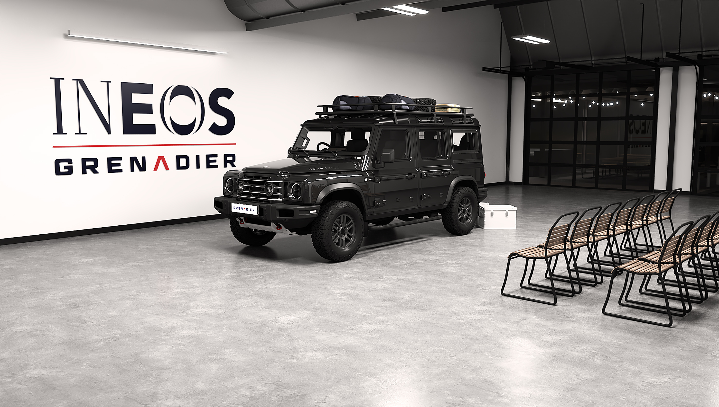
Jumping in, Fresh chose a stripped-back aesthetic allowing for the Grenadier to steal the show. Our design needed to mirror INEOS’ attitude of ‘removing the superfluous’. This called for a clean design that was tough, lean, capable, and purpose driven.

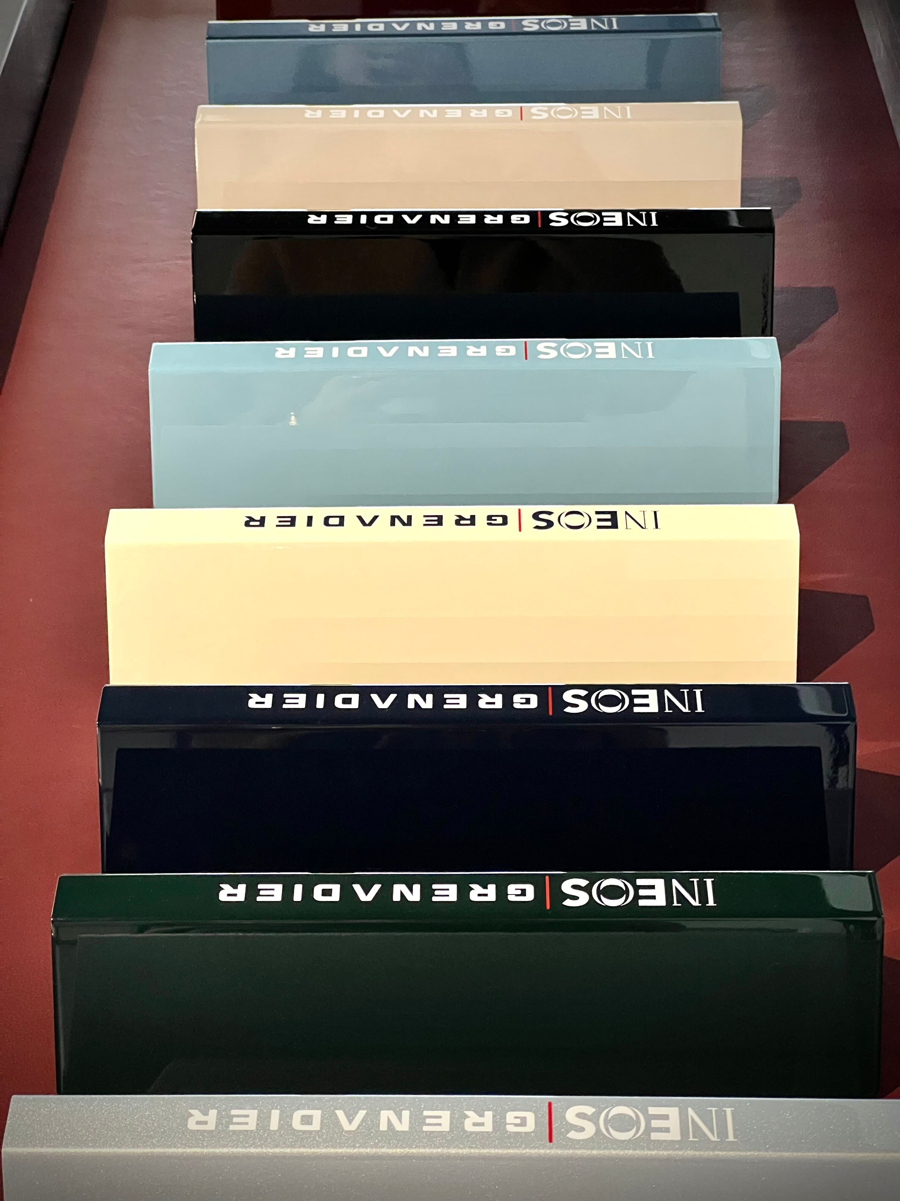
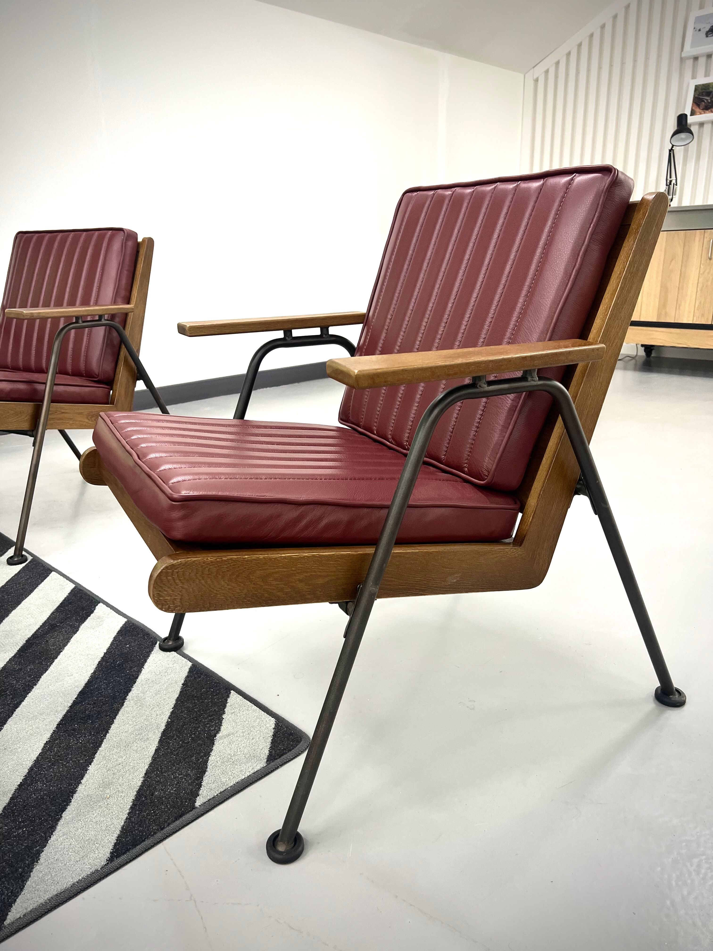
Teamed with simple, strong branding the retail space was designed in natural materials including wood, metal, and leather to highlight the Grenadier’s key design features.
Grenadier retail design

Our design principles

  • Built on purpose – does it need to be there? If not, get rid. No room for the superfluous!
  • Nothing to hide, a stripped-back aesthetic
  • Since Grenadier has no back story, focus on the modern and don’t try to create a missing heritage
Grenadier retail design

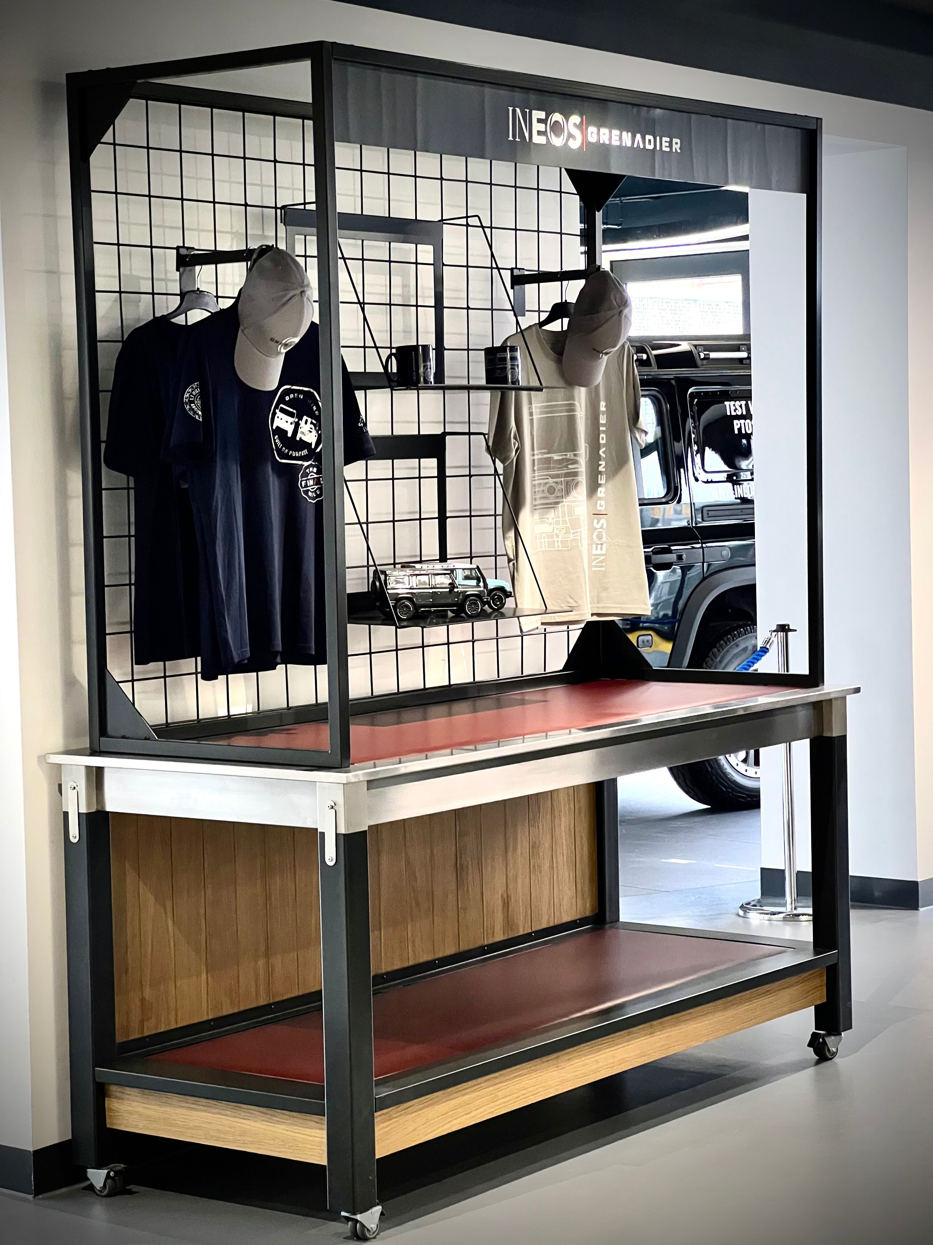
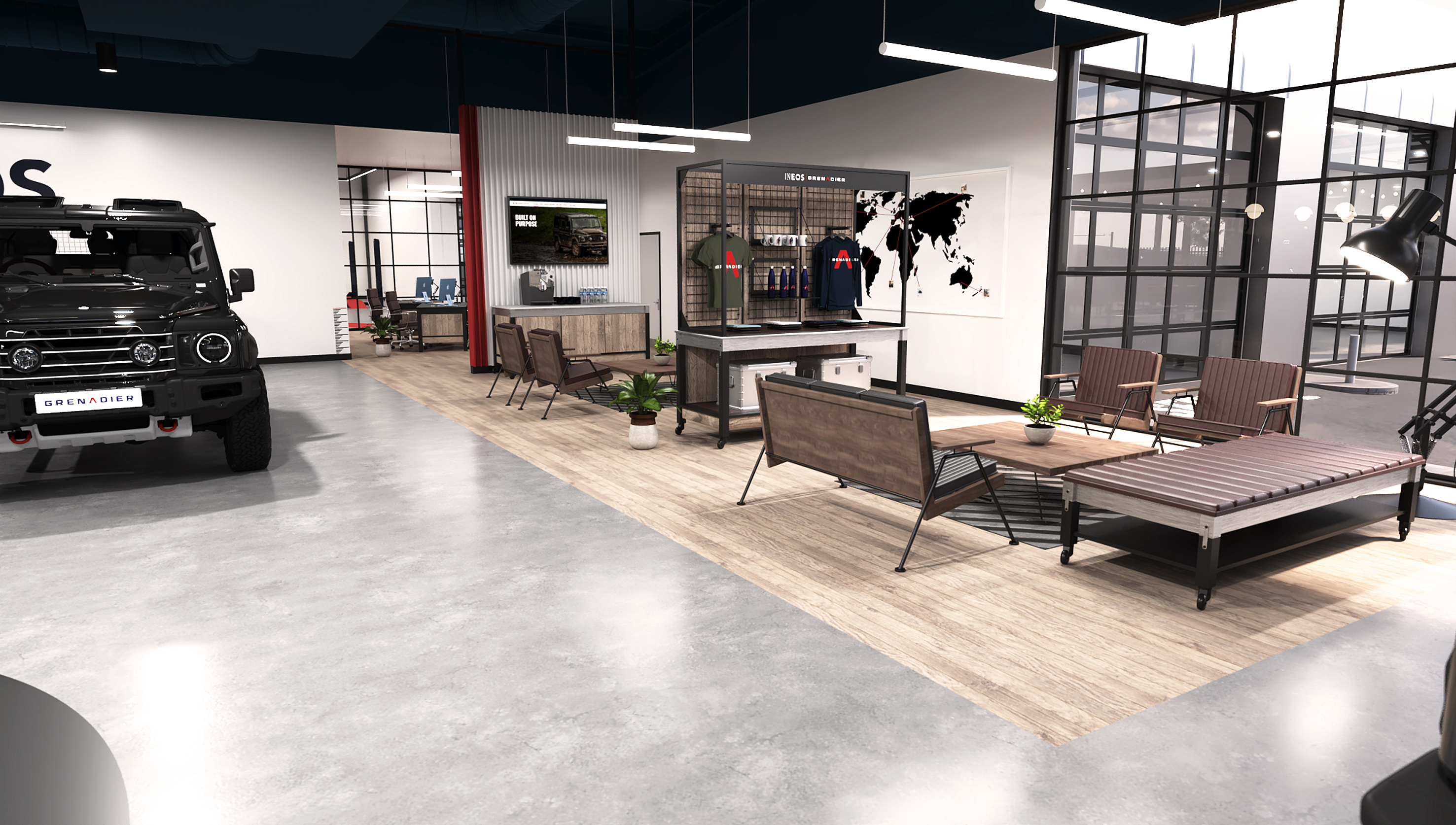
Fresh’s bench and display unit designs draw inspiration from the purpose-led items that may be found in exhibition spaces – practical, strong, and robust. 

Constructed from heavy-duty timber with lockable wheels, they offer durability and easy repositioning for agents’ convenience.

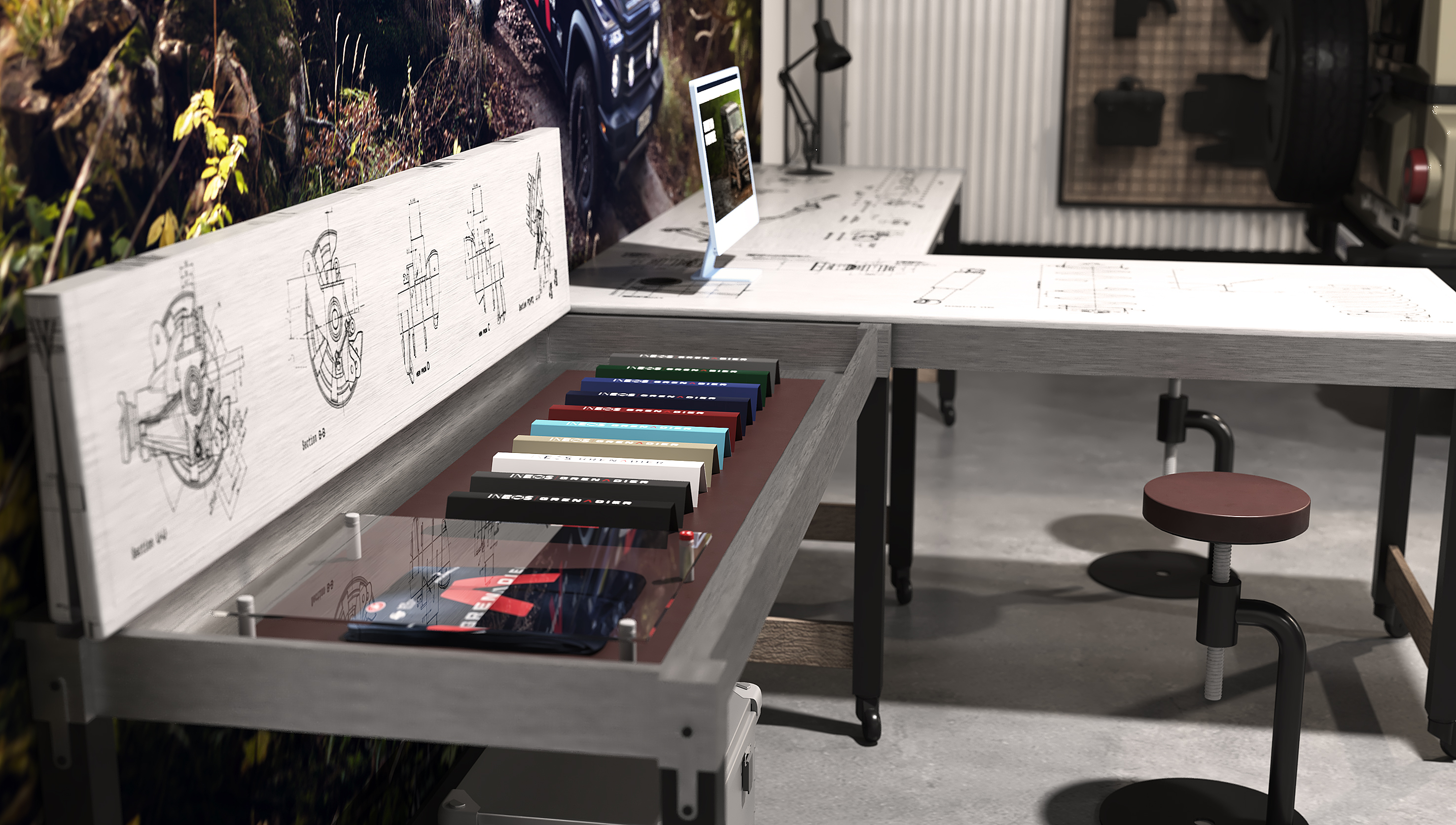
Steel worktops feature etched engineering drawings of the car’s technical systems. More etchings adorn wooden panels and screens across the space, and large-scale maps of local areas present nearby trails and routes ready for buyers’ exploration. 

Over time, agents can attach photos and trinkets to create a unique, personalised display.
Design elements

Jumping in, Fresh chose a stripped-back aesthetic allowing for the Grenadier to steal the show. Our design needed to mirror INEOS’ attitude of ‘removing the superfluous’. This called for a clean design that was tough, lean, capable, and purpose driven.

Teamed with simple, strong branding the retail space was designed in natural materials including wood, metal, and leather to highlight the Grenadier’s key design features.
We showcased the car’s ability to navigate waist-deep water by drawing attention to the wadding depth (800mm/31.5 inches) with water depth gauges to reflect this measurement. The workbenches tops are stainless steel, the legs are black to the wading height.

Fresh’s bench and display unit designs draw inspiration from the purpose-led items that may be found in exhibition spaces – practical, strong, and robust. Constructed from heavy-duty timber with lockable wheels, they offer durability and easy repositioning for agents’ convenience.

Steel worktops feature etched engineering drawings of the car’s technical systems. More etchings adorn wooden panels and screens across the space, and large-scale maps of local areas present nearby trails and routes ready for buyers’ exploration. Over time, agents can attach photos and trinkets to create a unique, personalized display.

Grenadier retail design

We showcased the car’s ability to navigate waist-deep water by drawing attention to the wadding depth (800mm/31.5 inches) with water depth gauges to reflect this measurement. The workbenches tops are stainless steel, the legs are black to the wading height.

Grenadier retail design

“The live venue step in the process highlighted a lot of useful stuff for us – not just in terms of what to include but also what to leave out: we’ve deliberately left voids in the design to allow the agents to add their own personality to the overall presentation.”– Simon Wardle, Managing Director

An inspired design, inspired by design

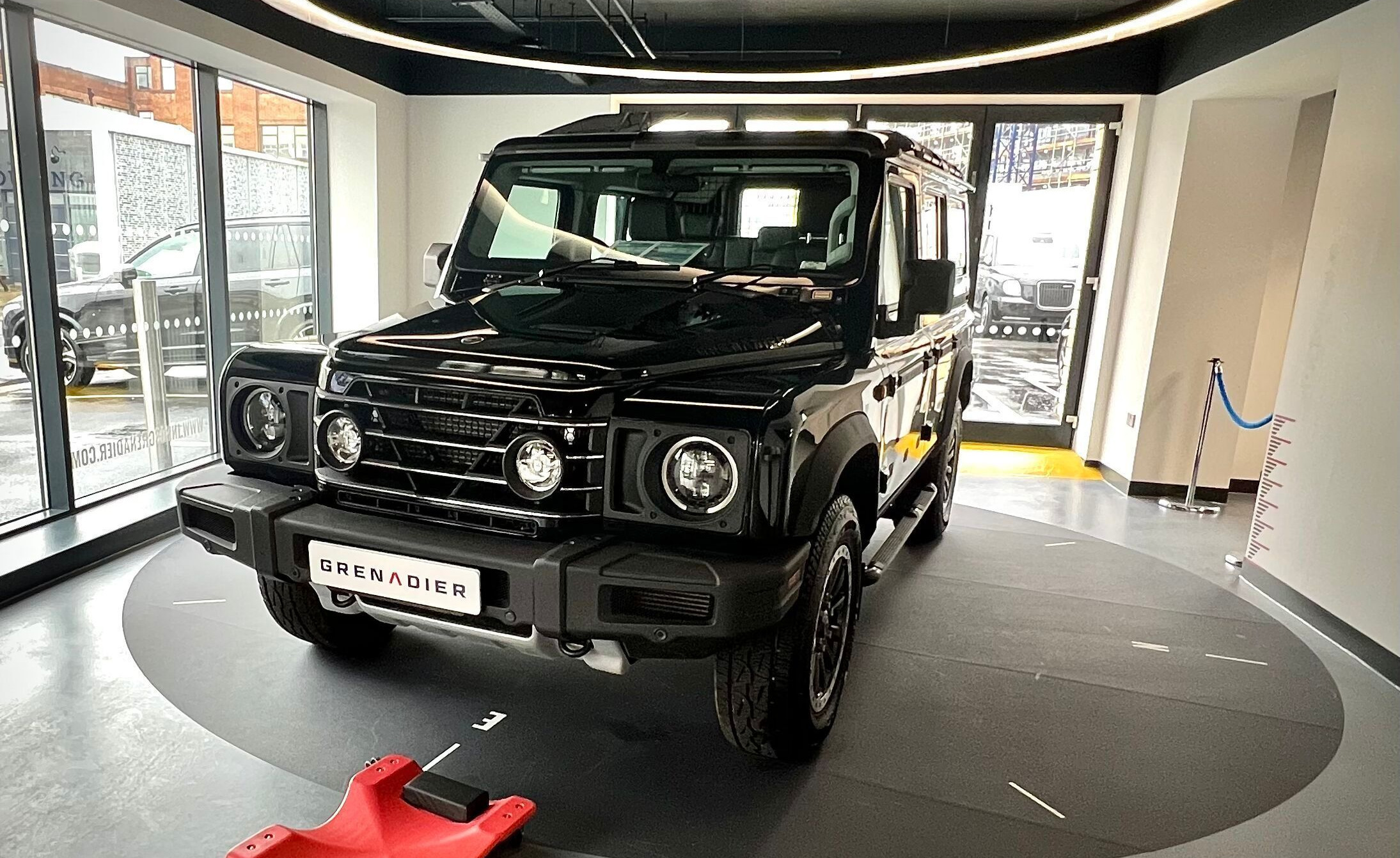
The Grenadier’s carefully considered design provided a rich source of design inspiration. The vehicle's powerful LED headlamps in an arched shape influenced Fresh’s lighting designs. Adopting the same arched approach to form ‘halo’ lights above the vehicle display, we added another playful twist by ensuring that the gap in the circle always points North.

We loved the shape of the headlamps – it works perfectly as display lighting and the gap gives us the opportunity for a bit of fun – every expedition needs a compass… and of course we’re proud Northerners!”- Paul Innes, Creative Director

We didn’t want to let any part of this amazing automobile go to waste, which is why Grenadier’s leather steering wheel covers were repurposed for stools, benches, and backdrops in display units. These included exhibiting essential partnerships such as the INEOS Grenadier’s cycling team and the Halo Trust landmine clearance. Additionally, the steel foldable tailgate camp table found in the vehicle was a back panel for the retail clothing display units.

The journey to roll out

Two initial venues were selected to assess effectiveness of the Fresh design concepts—in two very different spaces; these included an open-plan industrial unit and a traditional car showroom.

Both designs were a hit. These “test” launches prove invaluable for us to test and refine our ideas before moving to a broad rollout. During this process we learned that the exact design of accessories, such as furniture and flooring, were less crucial than their perceived quality, allowing agents to use existing chairs, sofas, and suitable natural floor coverings (like concrete or rubber) if they met quality and material standards.

Design expansion

The final stage in Fresh’s design process was expansion. Our job was to convert the Grenadier concept into an entire facility – rolling out the design to fit an entire dealership, complete with a showroom, workshop, sales reception, and exterior spaces.

This result speaks volumes about the strength of the initial ideas and plans. Some minor details changed, but the core concept remains and works brilliantly time and again. Our design places the Grenadier as the star of every showroom and gives INEOS’ knowledgeable customers a chance to get up close and personal with this remarkable vehicle.

Exterior design features include a ‘playground’ for customers to discover the full extent of the Grenadier’s extraordinary off-road capabilities. Fresh included other unique facilities – an outdoor events space for team gatherings, briefings, and seminars and an interior classroom for teaching expedition essentials for all levels.

A training area is also available for self-repair workshops to show customers how to fix issues in event of their Grenadier being damaged.

By staying true to the initial concept throughout the design expansion process, we have successfully removed the superfluous. The design prioritises functionality and efficiency, leaving the vehicle centre stage and ensuring everything around serves its purpose and does so in an aesthetically pleasing manner.

“I think the key to this project was that we identified the right approach from the start – and that initial idea was so strong that, unusually, a lot of the ‘pure’ design concepts from the first iterations made it through to the rationalised, pragmatic finalised rollout.” – Simon Wardle, Managing Director
 

Want to see our design for yourself? Click here to find your nearest showroom.

WE PROVIDE GLOBAL REACH WITH A LOCAL TOUCH